kenshi's Animation Adventures

An online diary of kenshi's foray into the animated arts.

Tuesday, April 26, 2005

Week 5: Obstacle Course


Planning, planning, planning...

Well, apparently the best way to get critiques from fellow students and campus mentors is to post a thread in the critique forums. That's where everybody seems to be going these days. I'm finding that not many students are online. I don't know if it's a technical glitch, where they are really there and I just can't see them for some reason or what.

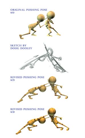
Anyhow, I posted this planning sketch to get feedback before I started on it, and Doug Dooley from Pixar (he also helped me out on my "Push Pose" from a few weeks ago) responded. Basically he said that when he started at Pixar, they gave him a very simple bouncing ball to animate in order to learn their software. Piece of cake? Well, they worked with him on it for 2 days, getting it just right. So, while he liked the ambition and enthusiasm of my idea, he encouraged me to use my creativity in less complicated ways for now. Not to lose it, but to really get the basics down before trying to tackle a challenging set-up like this. He said if he were to do this setup and do it RIGHT, it would take a while...hell, I'll just go ahead and post his entire reply:

Hey Kenshi,

Dude, you got the enthusiasm no doubt! Now, this is just my opinion, but I've seen students get really hurt by ambitious plans. I know you'll put the energy into it, and ball bounces can be really boring, but if you go that crazy with it, you may lose out on really learning the details of what makes ball bounces a %100 believable.

My first day at Pixar, they gave me a ball bounce to do to learn the software. I think "hey, I'm not the best, but I've been doing this for a while, I can do a ball bounce in my sleep. Dude they had me working on those 3 straight ahead ball bounces for 2 days trying to get all the right characteristics in each ball. Not that we have time in production to spend 2 days on a ball bounce, but it proves how much detail can go into a bounce to really get it right.

There is a lot to learn in this exercise thats boring, but if you get caught up with something this elaborate you may not get it just right. Studios will be more impressed with a reel that has a little animation perfect, than a lot of animation imperfect. Don't lose your imagination, just use it to come up with a simple imaginative thing.

I snuck a peek at your first ball bounce, and it was definitely good, but I think there was room for a bit of fine tuning. I really want to see you develope into a really good animator, so be careful to really learn the basics before you bite off something that big. If I was given your current plan to animate, I think I could eventually get right, with the help of people at work, but it would be really hard. I don't think you could get that in the required frame range either.

This definitely comes down to an opinion thing, but I've seen so many students drown in complicated projects, that I want you to at least realize what can happen.

Keep up the good work! It was a cool idea!

dooley

I guess my eyes are a little bit bigger than my stomach sometimes. So yeah, Doug's response was humbling to say the least. Not that I'm discouraged by what he said at all. It's actually quite a relief. I had been putting some pressure on myself to have the most creative ideas and do the most challenging things possible, but I don't need to be doing that. Confidence will come from learning the baby steps and just NAILING all of the basic principles of animation: timing, spacing, arcs, ease in and ease out, squash and stretch, anticipation.

When I critique fellow student's work, I am learning to critique the strengths and weaknesses of the work in terms of those principles: "I think the timing is right, but the spacing feels off..." I'm starting the think in terms of the principles. It really helps when it comes to seeing the bigger picture and being able to break down movement (a very complex thing) into parts you can break down and talk about in a way that makes sense.

I'm also learning that my sense of posing is probably my biggest strength at this point. Sure, on a certain level everything is subjective, but when it comes to the human body, it's much easier for me to pick out what's not working than on stuff like bouncing balls. Which only means I need to spend more time observing balls if I'm going to know how to make them move convincingly.


Monday, April 18, 2005

Elizabeth's Kenyan


After a long hiatus from the figure, I returned with renewed vengeance to the age-old practice last Saturday at the University of Utah (because they have a real art department with nude models - what a concept). It was my mainstay in college. How a person can get a BA in Visual Arts taking primarily only figure classes, I'll never know, but I didn't have any complaints (other than the creative stifling).

So after pages and pages of quick gesture drawings for AM class, it was nice to do a long pose (3 hours) and see how all that recent quick sketching would influence my longer passages. See the full image here.
(WARNING: Image contains nudity for those faint of mind.)

The main thing I noticed was that my gesture skills were MUCH better than normal. Blocking in the figure took much less time and I was able to get the proportions down more accurately. I also looked for visual rhythms and places where I could emphasize weight. And also I was less slave to the model and made more artistic decisions, while remaining true to the likeness. And my mark making was more committed than usual - I wasn't afraid to go dark (no pun intended).

I titled it Elizabeth's Kenyan because it is as ambiguous as the expression on her face ("Is her name Elizabeth? Or is she owned by this Elizabeth character, as in the possessive form of the word?"). She had such distance in her eyes - like she had checked out while the artists "used" her body - like she was calmly possessed. Rather intriguing, I must say. I've never drawn anyone that held that still. Granted, it was a reclining pose (yawn). But models tend to shift no matter the pose - not her. She was a rock - a very feminine rock, but a rock nonetheless.

When the pose was being decided, her shoulders and hips were absolutely paralleI. I thought, "You've got to be kidding me..." It was shocking that here were all these artists, and this was all they could come up with. Maybe they were being shy, but then again maybe they had little concept of solid posing. I guess most of them were just happy they had a naked lady to look at. So I added my two cents and suggested that she turn her hips. Like a well-designed car, it was a shame to hide those curves.

The model liked my drawing so much that I offered to give her a copy. We tend to be our own worst critics, so hers was the highest compliment of the day...


Modern Dance Sketching


Class 1 - Session 3 - sketchbook

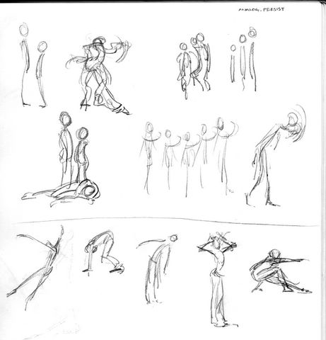
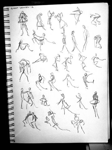
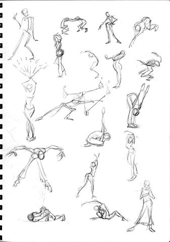
These sketches were all done last Friday (the 15th) at the University of Utah Modern Dance Senior Recital. I enjoyed drawing these dancers much more than the ones at Ballet West last week. I find that the poses and movements in modern dance are so much more expressive and raw. They aren't so concerned with how pretty they look or how elegant and dainty everything is. It's so much more human and spontaneous and powerful. They really make statements. Of course some find it to be pretentious and too art for art's sake, but there's something about it that I respond strongly to.

Class 1 - Session 3 - sketchbook

Class 1 - Session 3 - sketchbook

Sunday, April 17, 2005

Week 3: Evolution of a Shot


This was my first animation assignment, the first time I had to make something move. Getting up the courage to do it took longer than actually doing it. I didn't do my first draft til Wednesday, and it was horrible - really floaty, the timing and spacing were all way off. I went ahead and posted it on the AM site with a disclaimer, but people critiqued it anyway. Lesson learned: Don't put up sh*tty work, or people will tell you just how sh*tty it is.

So after that first horrible pass (which I'm keeping for posterity's sake), I quickly realized that I needed to put my brand new Canon ZR200 camcorder to use and film some actual reference. So David and I went to the racquetball courts and shot about 6 minutes of reference. That night I pulled out big wads of my hair trying to get the footage onto the computer, but finally got the issues resolved after calling Canon's support line the next day.

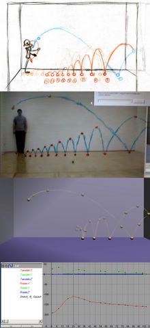
So after studying the footage frame by frame, I did a thumbnail drawing (top image) that followed the peaks of the arcs and where the ball made contact with the floor (usually just referred to as simply contacts) and then I drew in the arcs, literally connecting the dots. That gave me a good blueprint to start from.

I then opened a new scene in Maya, scrapping my original animation, and started setting keyframes at those contacts and highs. Then I remembered something Charles (my mentor) mentioned: DryErase markers. He just draws right on his screen all the time. So I got some of my own (see second image from the top) and found out exactly what those arcs looked like.

Something else I did was line up my video window directly over my Maya window so when I toggled between the two, the drawing on my screen would be in the same place on both video and my animation. Next I watched the video over and over, trying to time it out. I'm afraid my internal metronome is not working (that will be one of my next purchases: a metronome or stopwatch), so my animated interpretation was not very accurate. Now Charles advised against sliding the keys around to fix the timing because it cheats you from learning how to correctly time things. But the way I figure, I had to start somewhere, so I would make a guess as to where the ball should fall, play it back, and move it accordingly.

Then there was the graph editor I had to deal with (see bottom image). I'm not going to explain in too much detail (this entry is already technical enough), but suffice it to say that every keyframe that is set can be represented as a point on a graph. With this particular animation, I was dealing with two factors: how high the ball went (on the Y axis) and how far or close it went (on the X axis). The movement of the ball is dictated not only by these points, but by the curve created between these points. Luckily, the curves can be manipulated into different shapes by changing the angle of the tangents on either side of the points which in turn directly affect the nature of the movement.

Now efficiency is important in animation, especially on the computer - as that graph editor can quickly become a jumble of indecipherable curves. My main task was to figure out how to get this animation done in the fewest number of keyframes and still get convincing spacing and timing. Since I had 6 bounces, I knew I had to have at least 12 keys; 1 for the high (at the top of the bounce) and 1 for the low (the bottom of the bounce, or contact) - so after I set those positions and slid them around til I thought they were in the right places, I fiddled with the tangents to get the ball moving smooth on the arcs and really sharp and snappy at the contacts.

After I did all I could with that, I saw that I needed more hang time at the tops of the bounces, so I added 4 more keys to keep the ball up there longer after the last 4 bounces, and it was just perfect (to my imperfect eyes). Well, perfect enough to not be embarrassed showing it to my peers. Now I could only do 100 frames which at 24 frames per second (which is what film is projected at), that's just over 4 seconds of animation, which is why I didn't animate all 20 bounces the ball would have normally made.

You can see what I submitted to my mentor here. Now, after I was done with the ball, I went on to animate Stu actually throwing the ball, but things got confusing real quick. i got lost and found myself hacking through it - doing three versions and not getting satisfactory results with any of them.

So I'm glad we're starting out slow and simple - bouncing ball with no squash and stretch yet. I can't even imagine being able to make sense and keep track of keys on fully articulated characters. It's an overwhelming thought, but I'll get there eventually. My goal is to get to the point where Bobby (Beck) is at - where I'm animating from the inside out.

But for now, I have to wrap my head around this keyframe business. Enough to give you a migraine, I tell you.

Lend Me a Hand...or Your Arm


Assignment: Excitement

Now, one of the assignments this week was to take Stu (this simple biped character) and capture the emotion of excitement in one pose. I really wanted to steer clear of cliche, but I also wanted a very strong line of action and really solid posing.

My first sketches (on the right) were the obvious choices, with the lower sketch being too internal to be clear and the upper sketch way too korny. So I settled on the lower left, which initially was just the one triumphant Stu. But I wanted to add drama - some motivation - some kind of story, a bit of a problem when you have such a broad emotion to convey with such a simple character.

The solution, I found, was to give Stu a reason to be excited. So, borrowing from the world of testosterone-laden macho b.s., I came up with this scenario. I'm not entirely sure what he's going to do with arm now that he has it, but he's excited about it in any case.

Friday, April 15, 2005

Revisions, Revisions


Assignment Revision

Well, the third Q&A with Charles Alleneck worked for me. It was great to finally "meet" my mentor. Uploading my first assignment, however, was a bit of a nightmare and I was pretty much a basket case, trying in vain to get everything to work right. Ended up staying up til 4am that night - well, morning - and sending Charles an email that was 7 paragraphs too long... Uggghh. It was tragic. He liked my pose though and had a few suggestions to strengthen it even further - pulling the shoulder up and across, strengthening the silhouette and dipping his head a little lower.

A huge lesson I learned doing this pose was that you have to mentally treat 3D animation as a 2D medium. The kinds of questions you need to be asking yourself are, "Is this graphically the strongest it can be?", "How can I exaggerate the pose to get the right feeling?" NOT "Would this hold up in real life?" - because at the end of the day, every shot on the screen is a 2D image, and you're trying to capture the feeling of the thing rather than the reality of the thing. Also i learned the value of "pushing the pose" - making it as clear and as powerful as it can be, taking out the ambiguity, otherwise the audience will wonder, "What is going on?" Now it's perfectly fine to make the audience wonder WHY something is going one, but the WHAT should be clear.

I'm going beyond realism and really emphasizing the exaggeration right now, and I predict that eventually I will bounce back to somewhere in the middle. But now is the time for me to be learning the "rules" and how to operate believably within a traditional, animated world.

Then, after I learn the rules, I intend to break the hell out of 'em and see how far really this animation thing can go...

Monday, April 11, 2005


Page 10

Page 11

Page 6

Page 9

Page 8

Page 7

Page 5

Page 4

Page 3

Page 2

Page 1

Saturday, April 09, 2005


Pushing Pose Posted by Hello

Friday, April 01, 2005

Live Jam Session with the BOOM


Bobby "BOOM" Beck Posted by Hello


So, since I had technical problems with my first Q&A with my Charles Alleneck, I got to participate in a makeup session with Bobby Beck today. He is such a positive, energetic guy - so awesome to be interacting with these amazingly talented guys that have no ego at all and are really just there to train up the next generation of animators.

I got to ask him some questions live. How it works is that you submit a question in the queue and the speaker just takes questions as they come. When it's your turn, he'll pull up your webcam and then you're on the air, talking back and forth. There is a few second lag, but it's pretty much real time. Kind of mind trip, knowing that you're talking face to face with someone hundreds of miles away, when it feels like you're in the same room. It's so science fiction turned science fact. Very surreal.

So I asked him stuff like, "You said that Finding Nemo was a big breakthrough for you. What about that experience made it such a breakthrough?" And he went into how for the first time for him, the characters seemed to be animating themselves. Much more intuitive than before. He termed it animating "from the inside out" where the characters' inner thoughts and feelings were driving the performance rather than the "outside in", which would be the animator posing the characters and making the mouth move in hopes that they would appear to be living. He said it was animating on a whole new level.

I also asked about IK vs. FK arms (inverse kinematics vs. forward kinematics) - which method of working he employed. Of course he pointed out that IK and FK have different functions and in a lot of character rigs, you can switch from one to the other, but he works mainly in FK - he feels he gets better arcs that way and more control. There's something about having the shoulder go first, then affect the elbow, then the wrist, etc. that appeals to him when he animates it seems, rather than switching to IK, where you basically grab the wrist, move it, and then rest of the arm follows along, much like a marionette.

The last question he addressed had to do with the short film process. I wanted to know how much we would be responsible for and how much would be provided, specifically in terms of the rigs. He couldn't go into too much because it's supposed to be a little bit of surprise, but he did divulge that there will be a catalog of sorts that we can choose from when we go to do our short film - stock characters, I think, which will be created based on the input and ideas they get from us as we are developing our story ideas.

Before he went on to the next question though, I asked about facial animation - if we would ever get to that. And he was kind enough to go on and explain how all of the assignments build off of each other - starting with a ball, then a ball with a tail, then a ball with one leg, then two legs, and then spine and legs, and finally full biped character and later with full facial controls. Should be interesting to see how this all plays out, but that won't happen for another year (the last two classes).

He also mentioned a book by Desmond Morris called Manwatching that went into body and facial language from more of a technical standpoint. I'm really fascinated by that kind of stuff, so I'm going to try to track it down and study up on it. Bobby mentioned the "triangle" on the face from either corner of the eyebrows down to the nose and how that's where 90% of the emotion of the face is transmitted from.

He went over a lot of other stuff, but those were the main points I was concerned about. The vibe was very, very good - very positive energy, very sincere and made sure he was addressing everyone's needs while still making personal connections with students.

I can see why they call him BOOM.

Get Up and Act It Out


Stu in Manet's Olympia. Posted by Hello

I got more feedback from a mentor on my workspace, this time from Doug Dooley at Pixar. (He worked on the Academy Award winning short film Bunny back at Blue Sky Studios before going to Pixar). He said: HEY KENSHI, GREAT JOB! WHAT'S GREAT ABOUT YOUR POSES IS THEY TELL A CLEAR STORY EVERYONE CAN INSTANTLY READ.

So I sent him a quick note to thank him for the helpful specific feedback and he wrote back saying, "No problem. I was particularly impressed with what you did with a simple pose test. Actually you gave me some ideas too. Keep up the good work! - dooley" This exchange is a great example of the kind of ricochet effect all this energy is having on people and how AM is set up - ideas bouncing back and forth, everyone helping everyone else grow, learn, and progress. As portrayed in my Manet rip-off above, it's a literal "hotbed" of activity.

How exciting to be encouraged to be different and unique and creative for a change! Going through the Eric Goldberg guest speaker video (he is the animator responsible for Genie in Aladdin) he mentioned that one of the characteristics of a great animator was a sense of personal style and that he doesn't see enough of it in today's animations - putting yourself into the performance instead of cranking out keyframes.

I was completely mesmerized by the Traditional Animation Basics video on the AM site. Watching Sarah Mercey of Pixar hand draw 11 frames of a mouse skipping rope was like having a front row seat at a Masonic Temple ceremony or something - "Am I really being allowed to witness this?" Incredible. I've read about it for years, but nothing could prepare me for seeing it happen for the first time. Just an amazing process.

Some other information I took away from my first week of lectures was the importance of shooting live video reference. A lot of studios have a "mirror room" where animators can go and act out their scenes in front of huge mirrors and videotape themselves. Animator after animator talked about the importance of this. Not that it's a horribly novel idea or anything. The shot of the marine jumping up from laying on the floor was done from reference I did of myself back at Argonaut CG Films. It was just interesting that everyone in the industry does it and does it a lot.

Another no-brainer revelation is the importance of feedback from intelligent eyes outside your own head. I know from my job now doing packaging for video games that staring at an image too long can make you blind to its faults. Just recently in fact, my boss asked me if the pose I had rendered looked a little funny, and I said, "No. Looks just fine to me." The next morning, I re-opened the file and saw that the character really looked like he was going postal. Amazing what a few hours of time away will do for the eyes and mind, not to mention a pair of fresh eyes that are trained to see what works and what doesn't in terms of good animation.